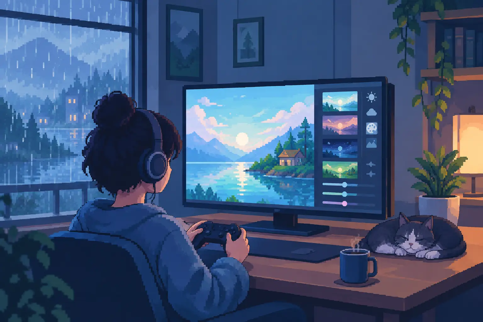
A game can feel completely different when its screen stops competing for your attention. A softer background, gentler motion, or clearer text can turn a quick idle check-in into a small moment of calm. Learning how to customize game visuals is less about chasing the most dramatic settings and more about shaping a space you genuinely enjoy returning to.
For relaxing games, visuals are part of the experience, not decoration around it. The right choices can make progression feel more satisfying, reduce visual fatigue during evening play, and give a familiar routine a more personal rhythm.
Start With the Feeling You Want From the Screen
Before changing individual settings, consider when and where you play. A bright, high-contrast look may feel lively during a short daytime break, while a dimmer, warmer screen often suits a quiet moment before bed. There is no single best visual setup. The most comfortable choice depends on your room, your device, and the mood you want the game to create.
Think in simple terms: Do you want the game to feel like a clear, focused dashboard, or like a soothing window scene you can leave running nearby? Idle games often work beautifully as ambient companions, so visual settings should support that low-pressure role.
If you are adjusting a game with rain, water, particles, clouds, or glowing effects, start by protecting the element you enjoy most. In a droplet-focused experience such as Droplet Idle, that may be the satisfying movement and shine of water itself. Everything else should help that centerpiece feel more peaceful, not distract from it.
How to Customize Game Visuals Without Overdoing It
The most effective visual changes are usually small. Adjust one category, play for a few minutes, then decide whether the screen feels better. Changing color, brightness, animation, interface scale, and effects all at once makes it hard to know what actually improved the experience.
A helpful order is to begin with brightness and contrast, then adjust color warmth, motion, and interface details. Those changes have the greatest effect on comfort without changing the game’s personality.
Set Brightness for Your Actual Environment
Phone screens often look brighter than necessary, especially in a dark room. Reducing device brightness can make glowing game effects feel richer while taking some strain off your eyes. If the game offers its own brightness or gamma control, use it for fine adjustments rather than pushing your phone to its lowest setting.
Avoid making dark scenes so dim that menus disappear or details become muddy. Relaxation should not require squinting. You want enough contrast to see droplets, rewards, buttons, and progress at a glance.
During daylight, a slightly brighter setting may be practical. At night, a lower brightness paired with a warmer display tone can create a softer, more restful look. It is worth making separate habits for each time of day rather than forcing one setting to work everywhere.
Choose Color That Supports the Mood
Color changes mood faster than almost any other visual choice. Cooler blues, gentle grays, and muted greens can feel clean and quiet. Warm golds, soft pinks, and amber lighting can make a game feel cozier and more intimate. Neither approach is better. It depends on whether you want refreshing calm or evening warmth.
If your device has a color filter, night shift mode, or eye comfort setting, try it with the game for a few sessions. These features reduce the harsh blue light common on bright displays. They can be especially pleasant with dreamy bokeh, rain effects, and slow-moving backgrounds.
There is a trade-off. A very strong warm filter can make white text look yellow and reduce the crispness of certain visual details. Keep the adjustment subtle enough that rewards, upgrade icons, and menus remain easy to read.
Let Motion Feel Soothing, Not Busy
Motion is one of the great pleasures of visual idle games. Water sliding across glass, soft light drifting behind a scene, or particles appearing at a steady pace can create a mesmerizing visual rhythm. But fast or constant movement can become tiring if every element asks to be noticed.
Look for settings related to animation quality, particles, screen shake, flashes, or motion effects. If a game allows you to reduce intense effects while keeping core animations active, that is often the most relaxing balance. You can preserve the living feel of the scene without turning every reward into a burst of visual noise.
Players who are sensitive to motion should disable screen shake first. This setting rarely adds meaningful information, and removing it can make taps and upgrades feel calmer immediately. Reducing flashes is another smart choice for late-night play.
Keep the Interface Clear and Comfortable
A peaceful game screen still needs to communicate. Currency totals, upgrade costs, timers, and offline rewards should be visible without crowding the visual center. If the game offers interface scaling or text-size settings, choose the largest size that still leaves the screen feeling open.
On a smaller phone, dense icons can make an otherwise beautiful scene feel like a task list. Simplify where possible. Hide optional notifications, reduce nonessential badges, and avoid leaving multiple menus open while the game idles. A clean screen makes it easier to enjoy the animation between decisions.
Notifications deserve the same care. A gentle reminder that offline rewards are ready can be useful. Frequent alerts asking for attention work against the stress-free experience many idle players want. Keep only the notifications that help you return on your own terms.
Use Performance Settings as Visual Settings
Frame rate and battery use can shape how a game looks more than expected. Smooth animation makes water, light, and gradual motion feel natural. On a device that can handle it comfortably, 60 FPS can make a noticeable difference in scenes built around fluid movement.
Still, maximum quality is not always the most relaxing choice. If your phone becomes warm, battery drains quickly, or animation stutters after extended play, lower the graphics setting a step. A stable, quiet experience usually feels better than sharper effects interrupted by lag.
For background play, consider whether a battery saver mode helps. Some games lower frame rate or simplify effects when they are not actively on screen. That can be a sensible compromise: save power while you are away, then enjoy the full visual atmosphere when you return for a few unhurried minutes.
Create a Small Visual Routine
Customization becomes more useful when it matches your habits. You might keep a brighter, clearer setup for quick afternoon progress checks and shift to warmer colors with reduced effects for your evening wind-down. Even a simple change in screen brightness can signal that it is time to slow down.
If the game supports themes, backgrounds, or visual presets, choose one for a full week before switching again. Familiarity is part of comfort. A favorite backdrop can become associated with a short break, a cup of tea, or the quiet minutes before sleep.
Resist the urge to optimize every setting forever. A relaxing game does not need to look impressive to anyone else. It only needs to feel good on your screen, in your hands, at the pace you prefer.
The best visual setup is the one that lets you notice a small, satisfying detail - a drop merging, a soft glow shifting, a number rising gently - and feel no pressure to do anything more.